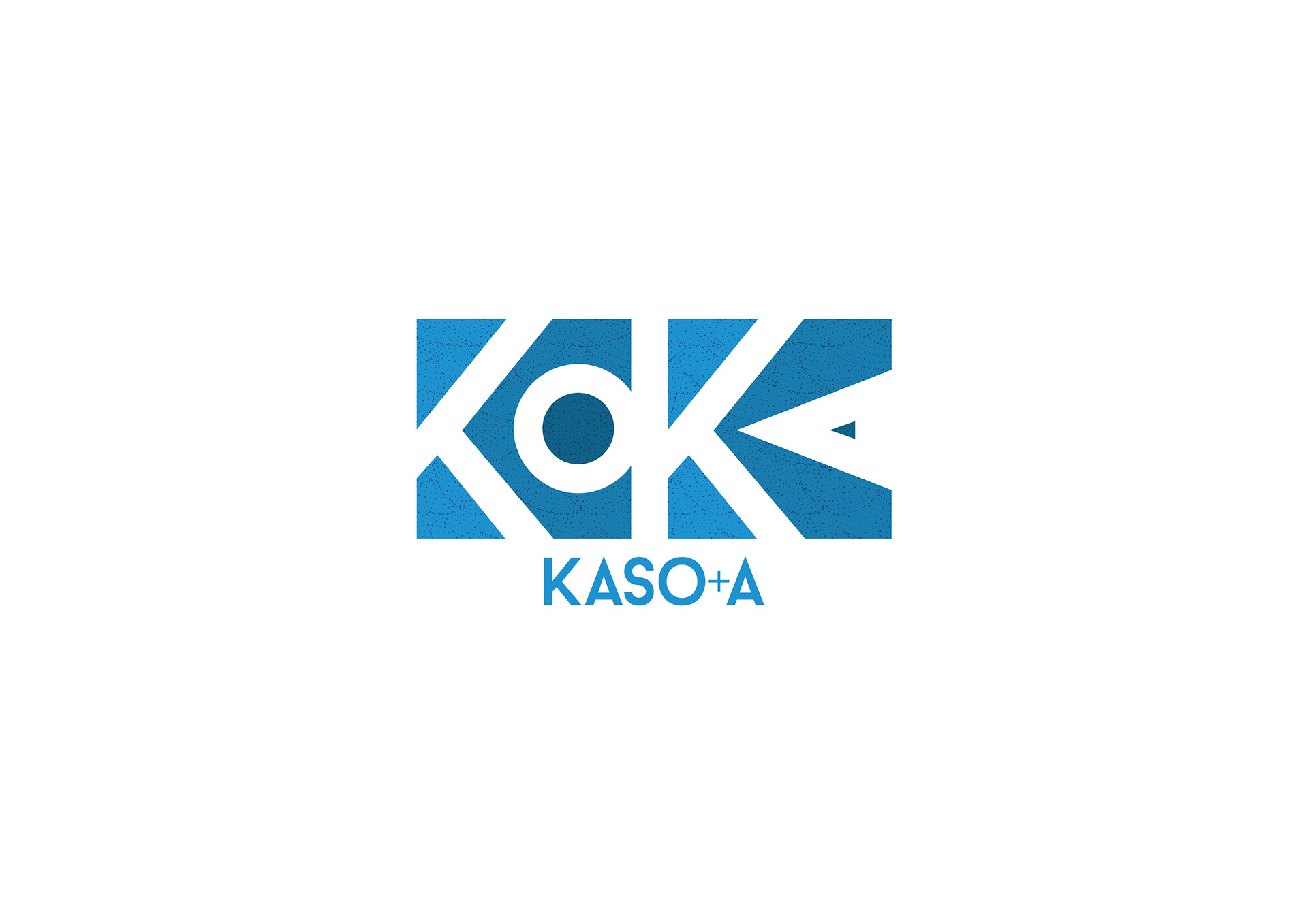

"Totemic shapes"
The architecture firms Kaso and Kasa share more than a few letters in common. In particular, they both take an eco-responsible approach to projects. This attitude is illustrated by the construction of several HQE and eco-responsible buildings, such as the first bio-climatic center in New Caledonia equipped with a low pressure well ensuring its ventilation.
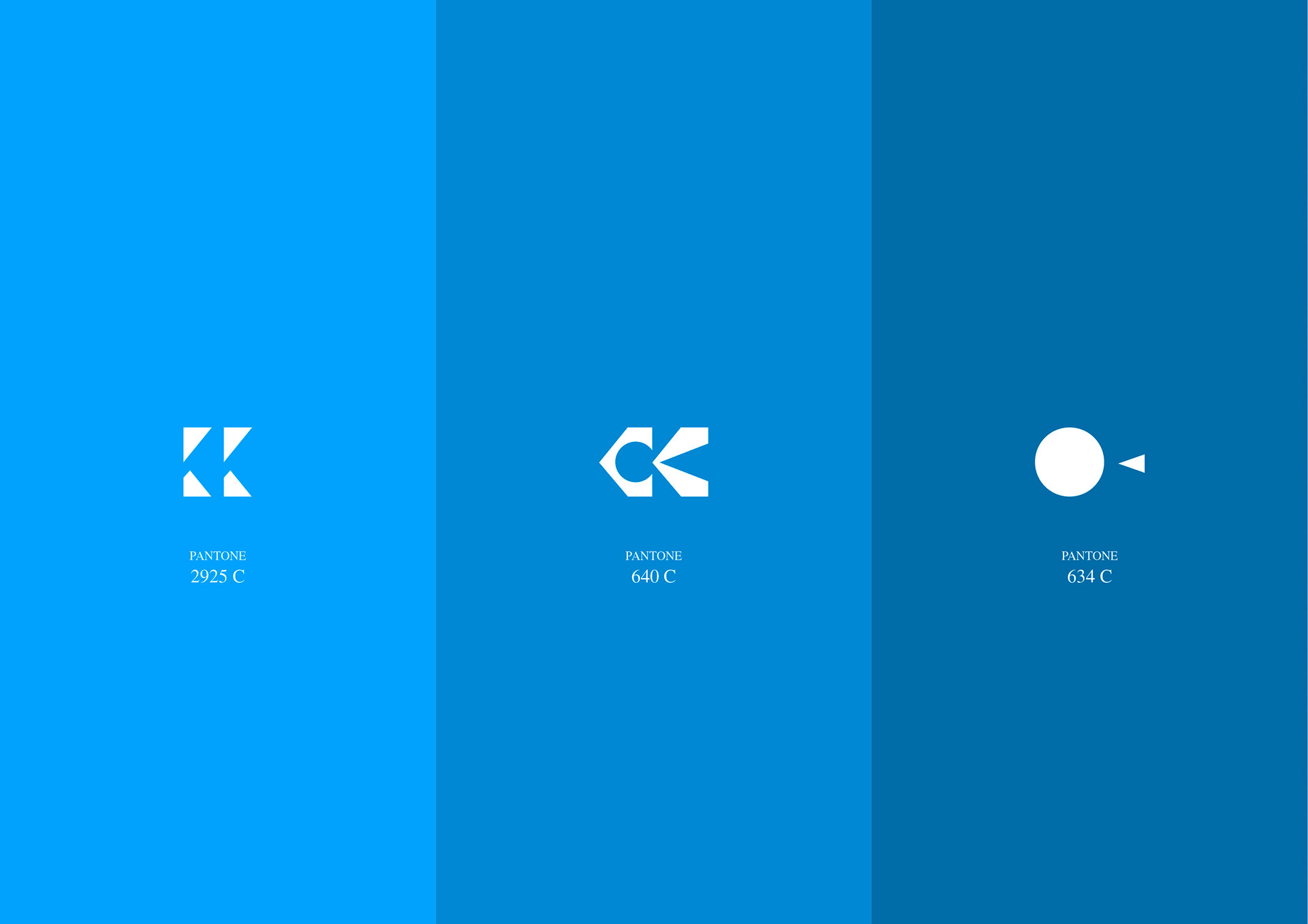
The association of these two firms led to the creation of a new multipurpose logo. It’s a sort of “2-in-1” logo, since Kaso can exist independently of Kasa, and vice versa. Playing on content and form, the association of the two logos evokes both a tribal motif and an urban plan. It results in the initials KO and KA being highlighted in a title block with bluish shades.